FarbpaletteKlicke auf ein Farbfeld, um den HEX-Wert zu kopieren
Schriften

Airtable
Geordnete Abläufe, lebendige Effizienz · Minimalistisch
Stil in einem Satz
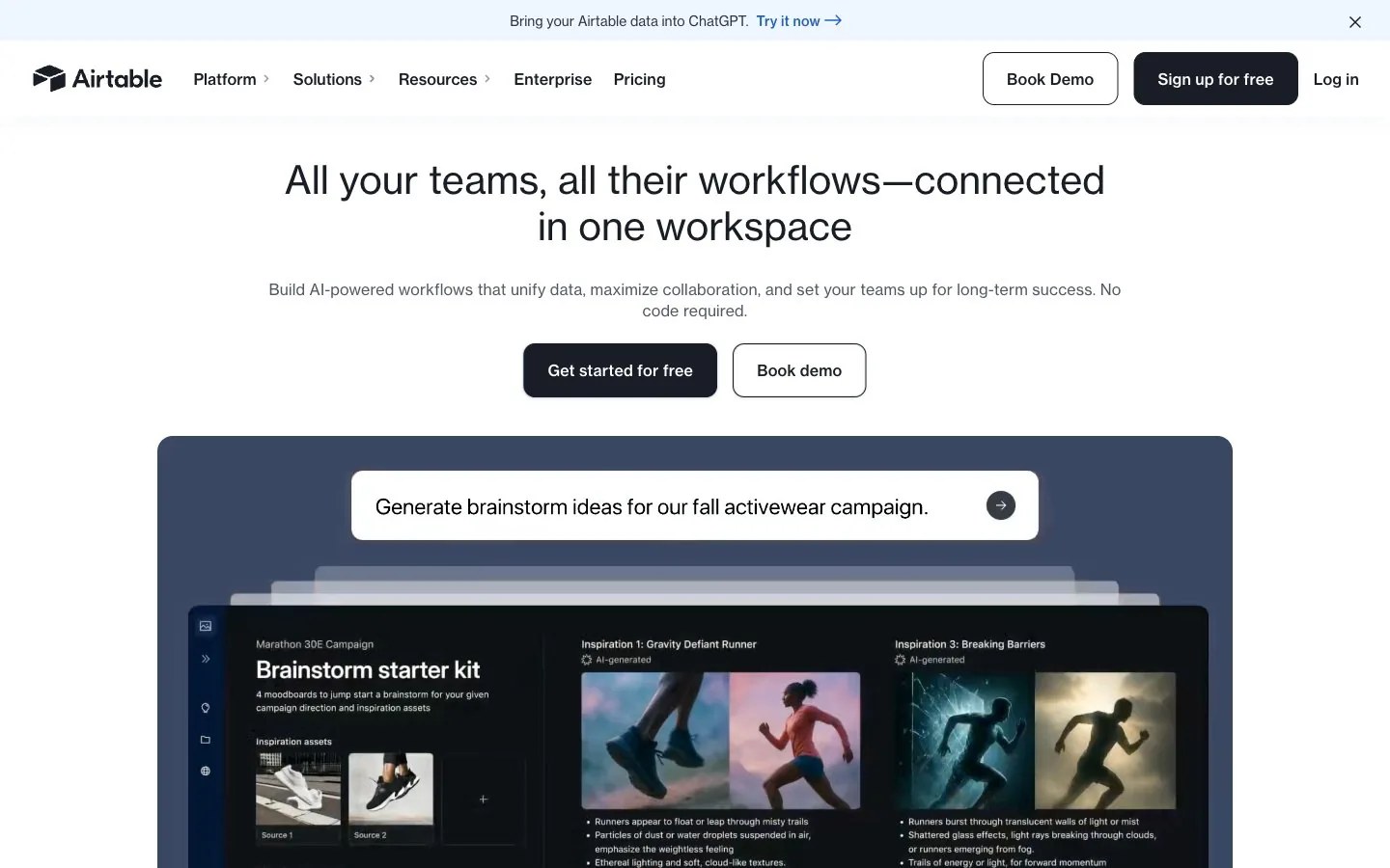
Polished command center: a bright white field above a deep slate showcase panel, translucent sheets layered in depth, inset cinematic photographs, ink-navy contrast and one cobalt highlight.
Über die Marke
- Beschreibung
- A polished, organized identity for products that bring order to complex work: crisp white space, deep ink navy, calm slate panels and a single cobalt highlight.
- Branche
- Work management software
- Zielgruppe
- Operations, marketing and product teams that coordinate projects and data across a company
- Tonalität
- Capable, clear, optimistic, grounded
Stil-Schlagwörter
organized workflow, layered sheets, slate showcase panel, ink navy contrast, cobalt highlight, cinematic photo insets, bright even light, structured grid
Bildaufbau
Center a short one- or two-line title near the top with one supporting line, then a solid and an outlined action side by side. Below, a wide rounded slate panel holds the main visual: stacked sheets or a grid of image tiles. Keep everything on a centered axis with even gutters.
Bildlook
Cinematic editorial photography with dramatic natural light, such as athletes caught mid-stride in mist, set into a tidy grid of rounded tiles; translucent sheets fanned in depth over a slate backdrop; crisp, evenly lit.
Empfohlen · 4
- Place the main visual inside one large rounded slate panel
- Arrange photos and shapes on a strict, evenly spaced grid
- Pair a solid ink-navy action with an outlined twin for secondary choices
- Use cobalt only for a link-like highlight or one key data point
Vermeiden · 4
- Bright colors as large background fields
- Heavy shadows standing in for tonal contrast
- Sharp-cornered frames mixed with rounded ones
- Low-contrast grey on grey for important lines
Vorlagen sind auf Englisch. Sobald daraus deine Marke geworden ist, kannst du die Inhalte in jede Sprache umschreiben.
Zero Kit AI steht in keiner Verbindung zu Airtable und wird von dieser Marke weder unterstützt noch empfohlen. Dieses Kit beschreibt lediglich einen visuellen Stil als Referenz.