PaletteCliquez sur une couleur pour copier son code HEX
Polices

Airtable
Flux soignés, efficacité vive · Minimaliste
Style en une phrase
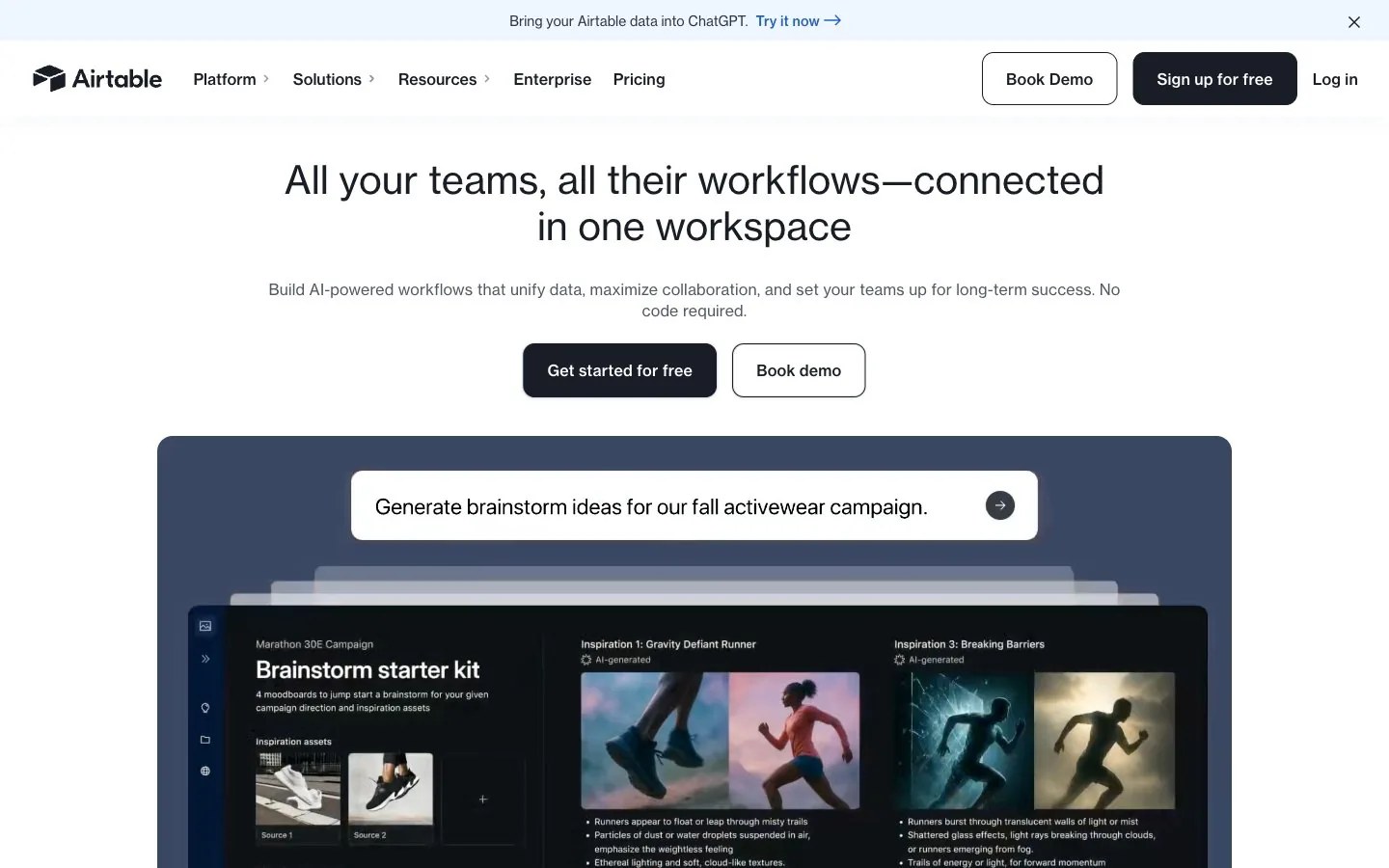
Polished command center: a bright white field above a deep slate showcase panel, translucent sheets layered in depth, inset cinematic photographs, ink-navy contrast and one cobalt highlight.
Présentation de la marque
- Description
- A polished, organized identity for products that bring order to complex work: crisp white space, deep ink navy, calm slate panels and a single cobalt highlight.
- Secteur
- Work management software
- Public
- Operations, marketing and product teams that coordinate projects and data across a company
- Ton
- Capable, clear, optimistic, grounded
Mots-clés de style
organized workflow, layered sheets, slate showcase panel, ink navy contrast, cobalt highlight, cinematic photo insets, bright even light, structured grid
Composition
Center a short one- or two-line title near the top with one supporting line, then a solid and an outlined action side by side. Below, a wide rounded slate panel holds the main visual: stacked sheets or a grid of image tiles. Keep everything on a centered axis with even gutters.
Rendu des images
Cinematic editorial photography with dramatic natural light, such as athletes caught mid-stride in mist, set into a tidy grid of rounded tiles; translucent sheets fanned in depth over a slate backdrop; crisp, evenly lit.
À faire · 4
- Place the main visual inside one large rounded slate panel
- Arrange photos and shapes on a strict, evenly spaced grid
- Pair a solid ink-navy action with an outlined twin for secondary choices
- Use cobalt only for a link-like highlight or one key data point
À éviter · 4
- Bright colors as large background fields
- Heavy shadows standing in for tonal contrast
- Sharp-cornered frames mixed with rounded ones
- Low-contrast grey on grey for important lines
Le contenu des préréglages est en anglais. Une fois qu’il est devenu votre marque, vous pouvez le réécrire dans n’importe quelle langue.
Zero Kit AI n'est ni affilié à Airtable ni approuvé par cette marque. Ce kit décrit un style visuel à titre de référence.