パレット色見本をクリックすると HEX をコピーします
フォント

Airtable
洗練されたワークフロー、軽快な効率 · ミニマル
スタイルをひとことで
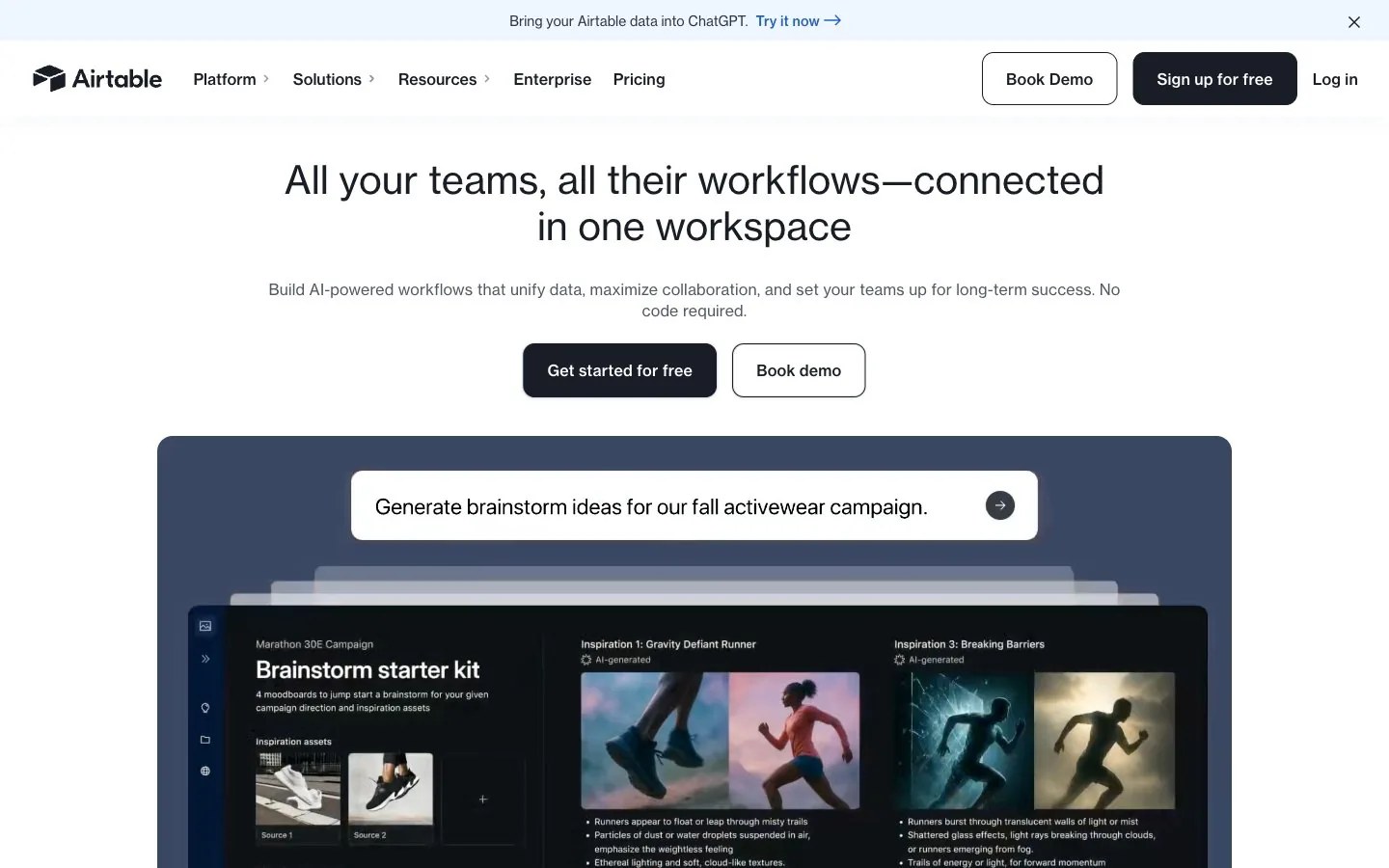
Polished command center: a bright white field above a deep slate showcase panel, translucent sheets layered in depth, inset cinematic photographs, ink-navy contrast and one cobalt highlight.
ブランド紹介
- 説明
- A polished, organized identity for products that bring order to complex work: crisp white space, deep ink navy, calm slate panels and a single cobalt highlight.
- 業種
- Work management software
- ターゲット
- Operations, marketing and product teams that coordinate projects and data across a company
- 語り口
- Capable, clear, optimistic, grounded
スタイルキーワード
organized workflow, layered sheets, slate showcase panel, ink navy contrast, cobalt highlight, cinematic photo insets, bright even light, structured grid
構図
Center a short one- or two-line title near the top with one supporting line, then a solid and an outlined action side by side. Below, a wide rounded slate panel holds the main visual: stacked sheets or a grid of image tiles. Keep everything on a centered axis with even gutters.
画面の質感
Cinematic editorial photography with dramatic natural light, such as athletes caught mid-stride in mist, set into a tidy grid of rounded tiles; translucent sheets fanned in depth over a slate backdrop; crisp, evenly lit.
すること · 4 件
- Place the main visual inside one large rounded slate panel
- Arrange photos and shapes on a strict, evenly spaced grid
- Pair a solid ink-navy action with an outlined twin for secondary choices
- Use cobalt only for a link-like highlight or one key data point
避けること · 4 件
- Bright colors as large background fields
- Heavy shadows standing in for tonal contrast
- Sharp-cornered frames mixed with rounded ones
- Low-contrast grey on grey for important lines
プリセットの内容は英語です。自分のブランドとして保存したあと、好きな言語に書き換えられます。
Zero Kit AI は Airtable と提携しておらず、承認も受けていません。このキットは参考としてビジュアルスタイルをまとめたものです。