パレット色見本をクリックすると HEX をコピーします
フォント

Grammarly
すっきりしたデジタルの便箋 · ミニマル
スタイルをひとことで
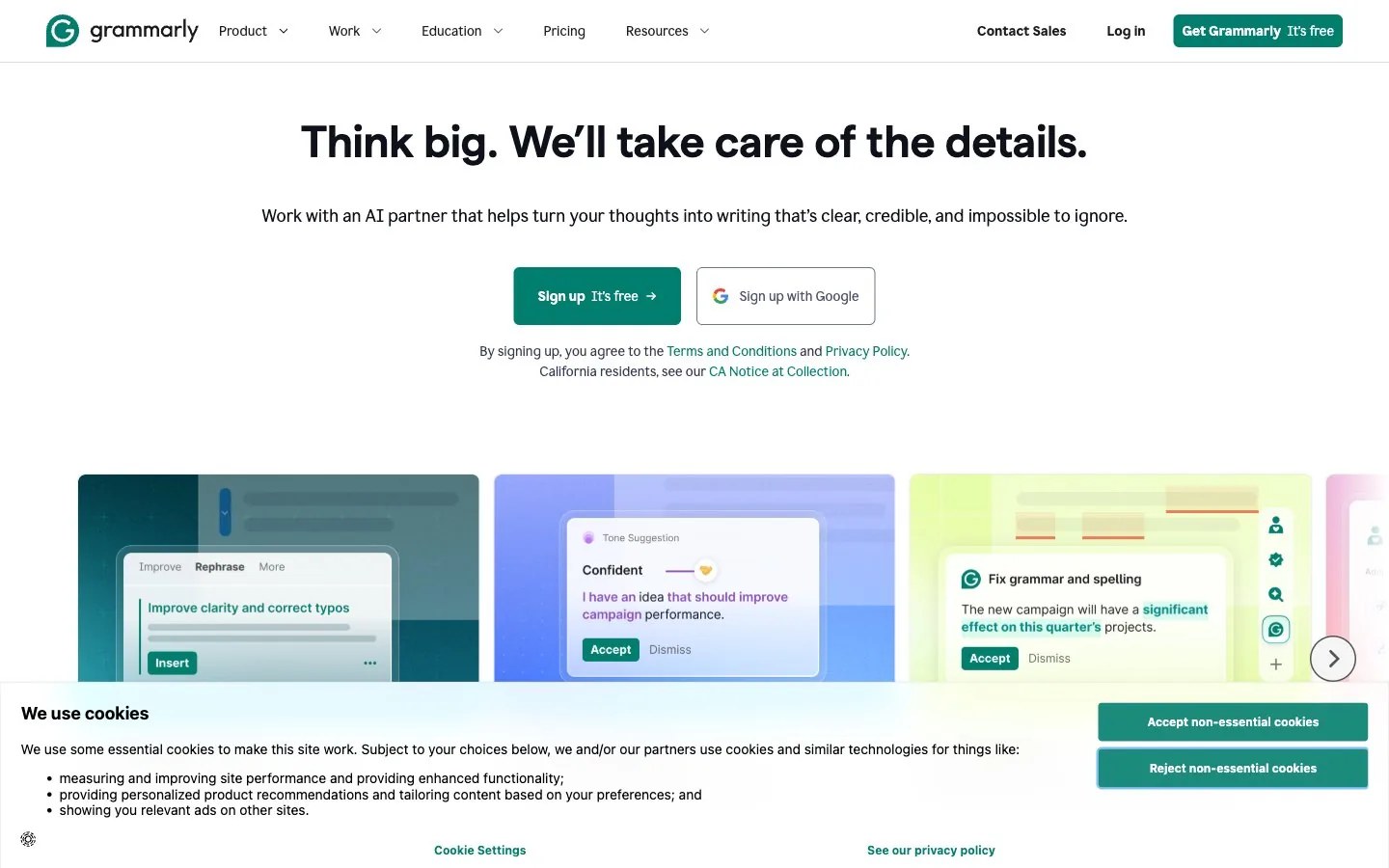
Crisp digital parchment: calm near-white space, deep ink and slate tones, one deep teal accent, soft periwinkle, lime and teal gradient panels framing a single focused visual, bright and orderly.
ブランド紹介
- 説明
- A grounded, clarity-first identity for brands built on words and precision: near-white space, deep ink, one strong teal and a few soft pastel washes for warmth.
- 業種
- AI writing assistance
- ターゲット
- Professionals, students and teams who write every day and want to sound clear and confident
- 語り口
- Clear, supportive, precise, understated
スタイルキーワード
clarity first, near-achromatic palette, deep teal accent, soft gradient panels, quiet confidence, precise alignment, bright daylight, airy
構図
Center one short, confident title with a single supporting line beneath and one teal action. Below, run a row of rounded gradient panels in teal, periwinkle and lime, each holding one simple visual. Keep the top half almost empty and align everything to a central axis.
画面の質感
Soft blurred gradient fields in teal, periwinkle and pale lime behind floating frosted-glass panels; calm lifestyle photos of people focused at a desk in bright natural light; flat surfaces, no heavy shadows.
すること · 4 件
- Let white space and one teal accent do most of the work
- Place visuals on soft pastel gradient panels with rounded corners
- Keep layouts centered and restrained, with one clear focal point
- Use teal for the single most important action or highlight
避けること · 4 件
- Extra saturated colors beyond the teal
- Drop shadows used for depth
- Busy patterns or loud full-bleed gradients
- More than two type families in one layout
プリセットの内容は英語です。自分のブランドとして保存したあと、好きな言語に書き換えられます。
Zero Kit AI は Grammarly と提携しておらず、承認も受けていません。このキットは参考としてビジュアルスタイルをまとめたものです。