팔레트색상 칩을 클릭하면 HEX가 복사돼요
폰트

Canva
생동감 있는 도구, 깔끔한 캔버스 · 발랄함
한 줄 스타일
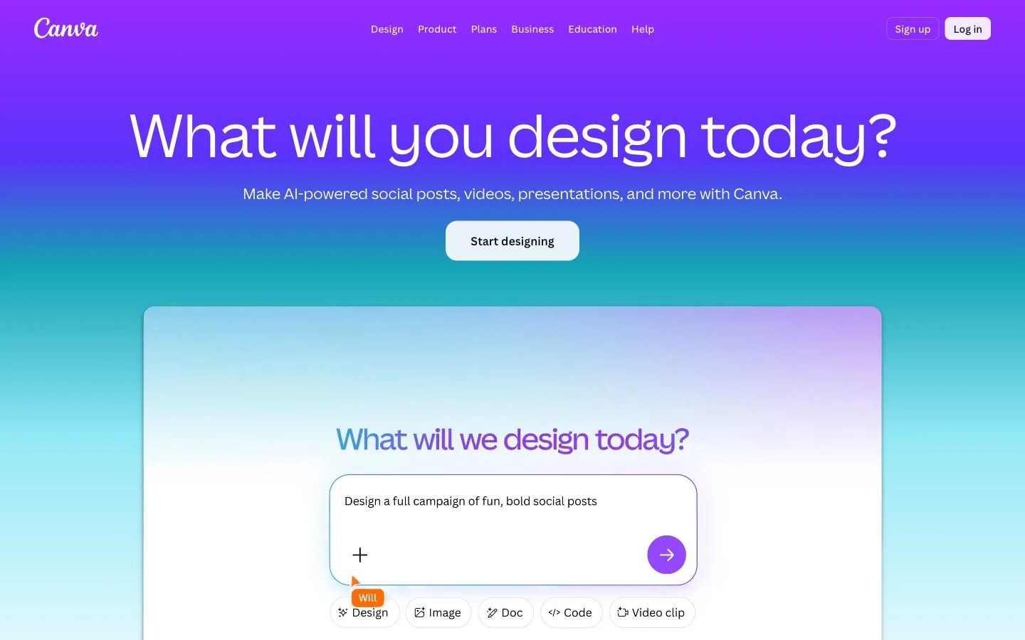
Vibrant creative gradient: a sweeping wash from electric purple through blue into bright teal and pale aqua, soft rounded forms, tangerine and orchid pops, friendly, upbeat and full of possibility.
브랜드 소개
- 설명
- Luminous purple-to-teal gradients and soft rounded shapes make this identity vibrant and welcoming; great for design tools, creator platforms, education and consumer apps.
- 업종
- Online design platforms
- 타깃 고객
- Creators, small businesses, students and teams who design without being design experts
- 말투
- Upbeat, encouraging, friendly, inclusive
스타일 키워드
purple-to-teal gradient, soft rounded shapes, tangerine pops, friendly energy, creative abundance, airy glow, approachable
구도
Run a vertical gradient from purple at the top to teal and pale aqua at the bottom, set a large, friendly centered headline in white across the top third and float one rounded white panel below it. Round every corner generously and keep elements centered.
이미지 질감
Bright, optimistic visuals: smooth color gradients, soft glowing blurs, playful stylized illustrations and clean lifestyle or product photos framed in rounded rectangles; saturated purples, teals and warm orange accents.
권장 · 4개
- Round every corner generously, from panels to small tags
- Let a purple-to-teal gradient carry large areas
- Add one or two small tangerine or orchid pops for energy
- Keep the mood welcoming with open spacing and centered layouts
피하기 · 4개
- Sharp corners and hard geometric edges
- Dark, moody or desaturated palettes
- Stiff serif or system-default display styles
- Cluttered layouts with more than two accent pops
프리셋 내용은 영어예요. 내 브랜드로 저장한 뒤 원하는 언어로 고쳐 쓸 수 있어요.
Zero Kit AI는 Canva 측과 제휴 관계가 없고 보증도 받지 않았어요. 이 키트는 참고용으로 시각 스타일을 정리한 것이에요.