팔레트색상 칩을 클릭하면 HEX가 복사돼요
폰트

Grammarly
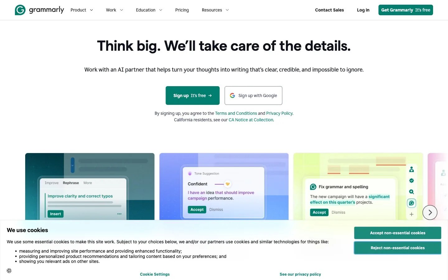
깔끔한 디지털 양피지 · 미니멀
한 줄 스타일
Crisp digital parchment: calm near-white space, deep ink and slate tones, one deep teal accent, soft periwinkle, lime and teal gradient panels framing a single focused visual, bright and orderly.
브랜드 소개
- 설명
- A grounded, clarity-first identity for brands built on words and precision: near-white space, deep ink, one strong teal and a few soft pastel washes for warmth.
- 업종
- AI writing assistance
- 타깃 고객
- Professionals, students and teams who write every day and want to sound clear and confident
- 말투
- Clear, supportive, precise, understated
스타일 키워드
clarity first, near-achromatic palette, deep teal accent, soft gradient panels, quiet confidence, precise alignment, bright daylight, airy
구도
Center one short, confident title with a single supporting line beneath and one teal action. Below, run a row of rounded gradient panels in teal, periwinkle and lime, each holding one simple visual. Keep the top half almost empty and align everything to a central axis.
이미지 질감
Soft blurred gradient fields in teal, periwinkle and pale lime behind floating frosted-glass panels; calm lifestyle photos of people focused at a desk in bright natural light; flat surfaces, no heavy shadows.
권장 · 4개
- Let white space and one teal accent do most of the work
- Place visuals on soft pastel gradient panels with rounded corners
- Keep layouts centered and restrained, with one clear focal point
- Use teal for the single most important action or highlight
피하기 · 4개
- Extra saturated colors beyond the teal
- Drop shadows used for depth
- Busy patterns or loud full-bleed gradients
- More than two type families in one layout
프리셋 내용은 영어예요. 내 브랜드로 저장한 뒤 원하는 언어로 고쳐 쓸 수 있어요.
Zero Kit AI는 Grammarly 측과 제휴 관계가 없고 보증도 받지 않았어요. 이 키트는 참고용으로 시각 스타일을 정리한 것이에요.