팔레트색상 칩을 클릭하면 HEX가 복사돼요
폰트

Microsoft
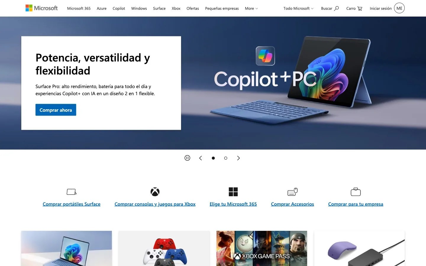
선명한 화이트 블루프린트 · 미니멀
한 줄 스타일
Crisp corporate blueprint: a sleek device or workspace scene bathed in deep sapphire light beside a clean white panel, one confident blue accent, square edges, bright and orderly.
브랜드 소개
- 설명
- A clear, dependable corporate identity: crisp white panels over deep-blue photography, square geometry and one confident blue. Suits brands that want to feel capable, organized and trustworthy.
- 업종
- Enterprise software and devices
- 타깃 고객
- Professionals, businesses and everyday users choosing reliable tools for work, study and play
- 말투
- Clear, capable, approachable, dependable
스타일 키워드
corporate clarity, deep blue photography, crisp white panels, square geometry, orderly grid, confident blue, dependable, bright
구도
Split the canvas: a full-bleed photographic scene on one side and a solid white panel on the other holding a short bold title, one supporting line and a single square blue action. Keep corners sharp, snap to a strict grid and repeat the rhythm in rows of equal tiles.
이미지 질감
Polished product and workspace photography: thin laptops, tablets and accessories at a three-quarter angle against deep blue gradients or soft white studio backdrops, cool light, glossy screens glowing with soft abstract color blooms.
권장 · 4개
- Pair every photograph with a flat white panel so the message sits on a clean field
- Give the blue a functional job only: the main action and key links
- Keep corners square or barely rounded and snap everything to a grid
- Show devices in real use, with hands, desks or people nearby
피하기 · 4개
- Saturated colors beyond the single brand blue
- Decorative script or display lettering
- Bubbly pill shapes and overly playful forms
- Cluttered photo collages with no clear focal point
프리셋 내용은 영어예요. 내 브랜드로 저장한 뒤 원하는 언어로 고쳐 쓸 수 있어요.
Zero Kit AI는 Microsoft 측과 제휴 관계가 없고 보증도 받지 않았어요. 이 키트는 참고용으로 시각 스타일을 정리한 것이에요.