팔레트색상 칩을 클릭하면 HEX가 복사돼요
폰트

Uber
선명한 모노크롬 실용성 · 볼드
한 줄 스타일
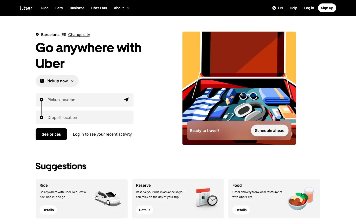
Crisp monochrome utility: bold black shapes on an expansive white field, soft grey capsules, one calm blue-green note and a single punchy illustration of a journey or delivery, direct and efficient.
브랜드 소개
- 설명
- Crisp, high-contrast monochrome built for clarity and action: bold black-on-white hierarchy with one calm accent, made for mobility, delivery and on-demand services.
- 업종
- Mobility and on-demand services
- 타깃 고객
- Busy urban commuters, travelers and people ordering everyday services on the go
- 말투
- Direct, clear, efficient, confident
스타일 키워드
high-contrast monochrome, black on white, capsule shapes, semi-flat geometric illustration, urban mobility, functional clarity
구도
Split the canvas: a heavy, tightly set headline and one short line on the left, one bold illustration or photo in a rounded rectangle on the right. Use a solid black band for emphasis, capsule-shaped action shapes and wide white margins.
이미지 질감
Semi-flat, blocky editorial illustrations of everyday journeys, luggage, food and city scenes; geometric shapes, limited palettes with punchy warm yellows and reds, solid black shadows, set on crisp white.
권장 · 4개
- Set headlines heavy and black, large enough to anchor the layout
- Use capsule shapes for actions, tags and small grouped items
- Keep backgrounds flat white or light grey
- Let a single illustration carry all the color
피하기 · 4개
- Extra saturated colors across backgrounds or large areas
- Gradients, textures and patterned surfaces
- Heavy drop shadows and glossy effects
- Thin, decorative display weights that weaken the contrast
프리셋 내용은 영어예요. 내 브랜드로 저장한 뒤 원하는 언어로 고쳐 쓸 수 있어요.
Zero Kit AI는 Uber 측과 제휴 관계가 없고 보증도 받지 않았어요. 이 키트는 참고용으로 시각 스타일을 정리한 것이에요.